Resources
Brand kit
The wordmark, the socket face, the colors and the images Socket uses, with the files to download.
Socket's look comes from one object: a wall socket. Every pool is drawn as a socket face, its hook as a colored plug sleeve, its permissions as the contacts that light up. The brand uses the same parts.
The wordmark#
The name is set in Archivo at its heaviest weight and widest width, outlined, with the socket face standing in for the o. The face is the same in every size: the key at the top, six hook contacts on a hexagon, two blades in the middle.
- Use the wordmark in ink on light backgrounds and in plate on dark ones. Don't recolor the letters.
- The contacts may light in copper at large sizes. At small sizes keep them the color of the letters.
- Leave clear space around it at least the height of the face on every side.
- Don't set "socket" in another typeface as a stand-in, and don't separate the face from the letters to make a new lockup.
Where the name already appears nearby, the face alone is the symbol. The app icon puts it on an ink tile with copper contacts.
Colors#
Each hook has one color, used wherever that hook appears: on its plug, its card, its pool's face. Copper is the only accent; a lit contact is the only place it glows.
Type#
| Face | Use |
|---|---|
| Archivo, 800, width 112 to 118 | Headlines and the wordmark. |
| Archivo, 400 to 700, width 100 | Body text and interface. |
| Fragment Mono | Addresses, numbers in tables, code. |
Both are free under the SIL Open Font License.
Files#
Logo





Social

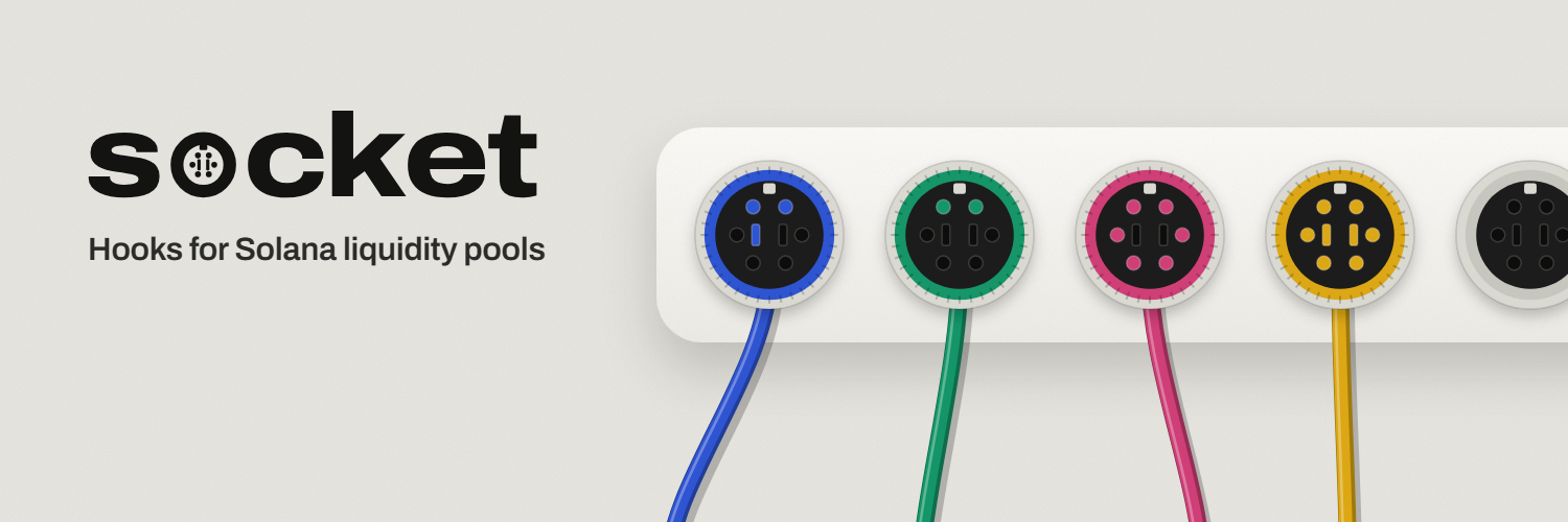
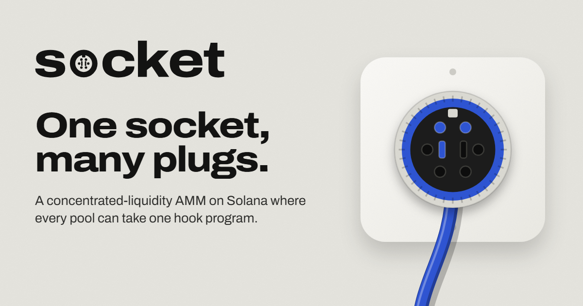
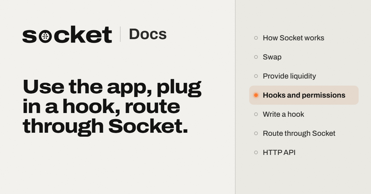
Plugs
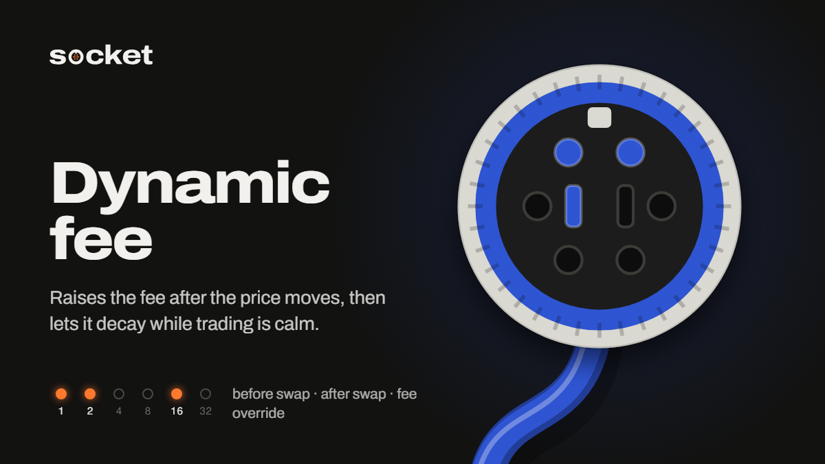

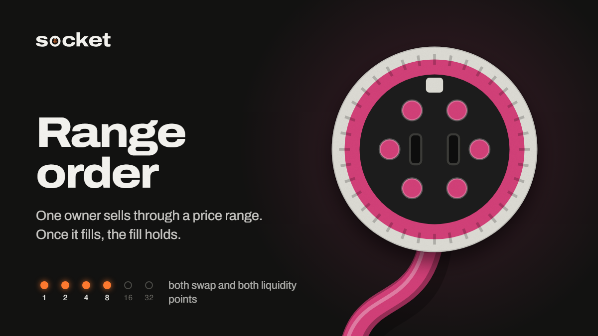
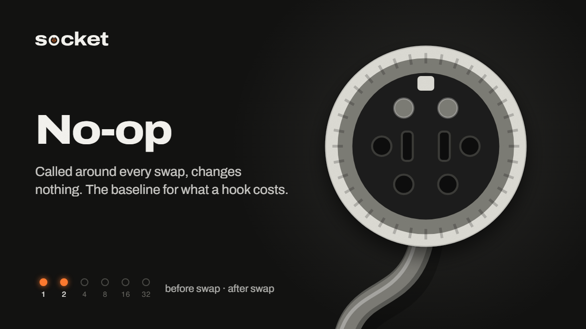
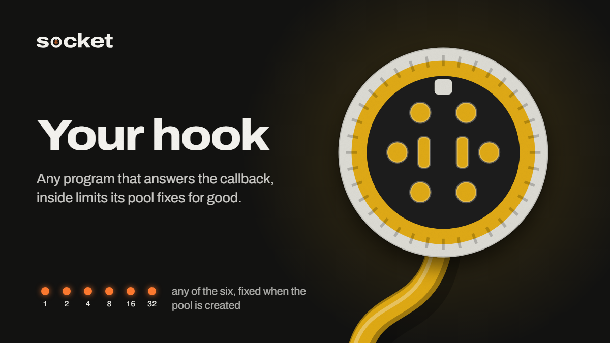
Images for posts follow one rule: the subject is a socket face or a plug, shown head-on, at the size of the frame. No mockups, no gradients standing in for meaning, no claims in the picture that the product page doesn't make.